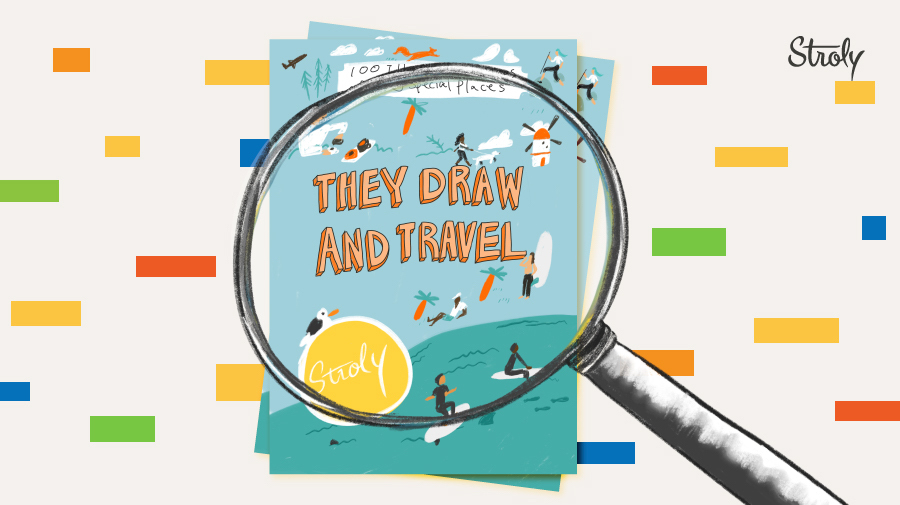
Last year, we sponsored They Draw and Travel Illustrated Map Contest and had the privilege to see more than 300 stunning illustrated maps submitted from illustrators around the world. Among those maps, we carefully chose the top 100 that are now published in the book, They Draw and Travel: 100 Illustrated Maps of Very Special Places, edited by Nate Padavick. Each map on the book contained a unique QR code that gave viewers access to online interactive experience on Stroly.com.
We were curious to unfold the trends of illustrated maps entered into the contest and understand the styles the map makers applied. At Stroly, we have a team of map experts that analyzes illustrated maps. This time they’ve analyzed the themes, elements, and compositions of every map submitted to the contest. Let us reveal some of the insights we’ve gained and show you the best examples that represent each finding.
Areas Illustrated:
So with which areas did the map makers felt emotionally connected? We found out that among 100 maps entered into the contest, the most popular places drawn were cities, contributing 46 percent of the total entries, followed by neighborhoods representing 22 percent of the total. We saw many beautiful cities across the world from Kansas City to Cabo San Lucas and attractive neighborhoods in Brooklyn and Amsterdam. Some map makers illustrated places near the water, such as coastlines, islands, beaches, and lakes, which shared 20 percent of the total.
(What to See in KC by alyssamariag)
(Jeju Island by Kelsey Cretcher)
Means of Transportation:
On our previous blog, our map illustrator, Kaoru at Stroly, mentioned how defining the types of transportation is an essential part of making user-friendly illustrated maps. If you think of what kinds of transportation to include in a map, you get a rough idea of the range you want to cover. We checked what type of transportation the map makers included in their maps. Here is the result of the number of maps with each type of transportation.
![]()
Many map makers included cars as primary transportation. We also saw maps that have more than one type of transportation depicted. Whether you are driving with your friend or taking a dog for a walk, the result shows that there are different ways to explore one place, depending on how you move around the area. Fascinatingly, we also discovered maps with unique transportation modes, such as helicopters, tuk-tuks, and even horseback riding!
(Historic Portsmouth NH by Carolyn Vibbert) This map has multiple means of transportation, including bike, boat, kayak, and on foot.
(Chennai by Aparna Vijayan) This map has Tuk-tuk!
Color Palettes:
Picking the right color palette for your map plays a significant role as it conveys what kind of mood and feeling you want the map to have. The map makers who participated in the contest have certainly tapped into their creativity and imagination of colors. Though we frequently found oceans colored in blue, and natures in green, some maps had unconventional colors. Overall there were many maps with muted, subdued colors that are easier for eyes. These less vibrant but more calming colors seemed to be popular among the map makers.
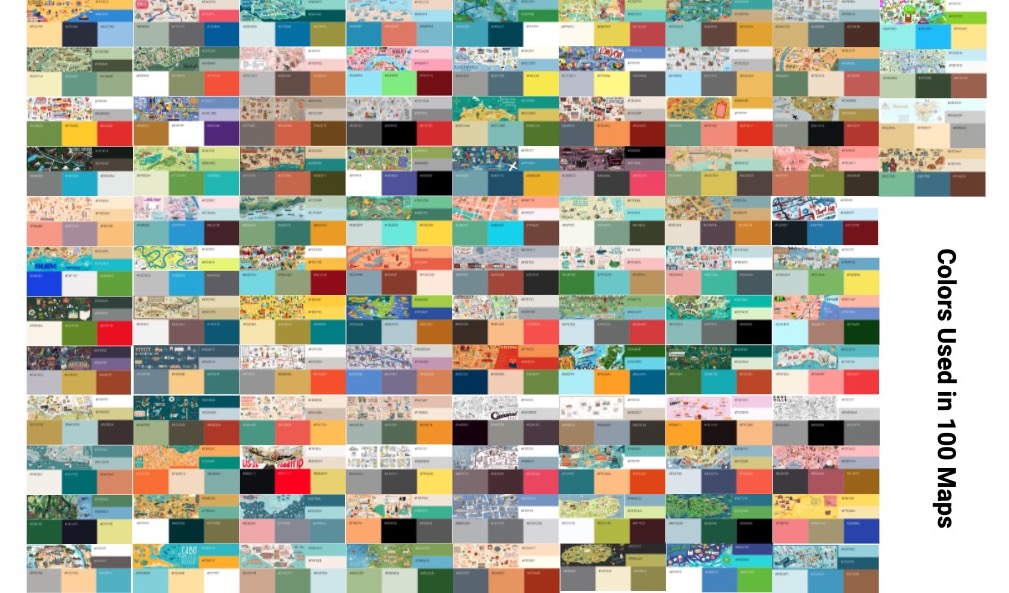
(Dubai, United Arab Emirates by Thao Nguyen)
Goals:
In our blog, we’ve introduced how you can start creating a map by firstly setting a goal. By doing so, what you want to achieve on your map becomes more transparent and accessible. Even when there is no specific goal set for your map, the viewers can still imagine the motivations or purposes behind the map-making process. Whether it’s about sharing your lovely holiday destination or the best places to eat in your neighborhood, at Stroly, we believe there are three main types of goals when creating a map.
One of the goals for creating a map is to show some of the beauty and attractions of a place. These maps unveil general interests unique to certain areas so that people can utilize them for sightseeing or get inspired to visit.
The second type of goal is to delve into a particular theme, usually within a small part of the area, for example, the best vegan cafes in Lincoln Square, Chicago. These maps are particularly useful and convenient for people looking for specific information, including those who live locally.
Finally, some maps tell personal stories, historical events, or unknown anecdotes based on the map maker’s experience or knowledge. Once you learn these stories, you discover amazing facts, and the place becomes more relevant to you.
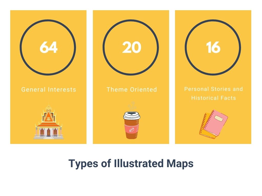
So which one of these maps did we see the most? We discovered that most maps included general interests, such as monuments, art galleries, national parks, beaches, and accommodations, thus promoting the beauty and attractions of the areas. Also, among 100 maps, we saw around 20 theme-oriented maps with specific information unique to the areas, and further, 16 maps with personal stories that let the viewers follow in someone’s footsteps. And, of course, there were maps that had more than one type of goal illustrated!
In the next part of this blog, our map expert Kaoru will further explore the different types of illustrated maps. She will share some helpful tips and information to create the maps successfully according to your goals!
For those of you who haven’t had the chance to see the maps submitted to the contest, click here.