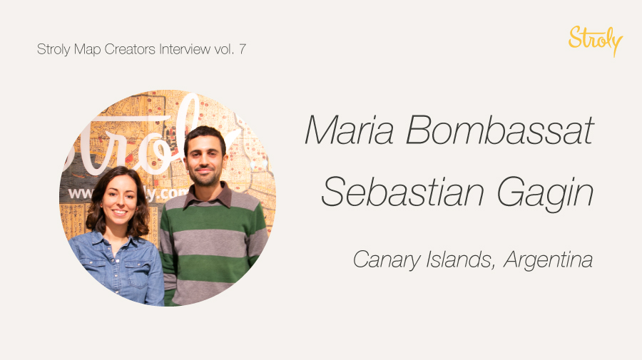
We would like to introduce you two professional illustrators, Maria and Sebastian!
They are Stroly users and we had a privilege to ask them about map-making and their future outlooks.
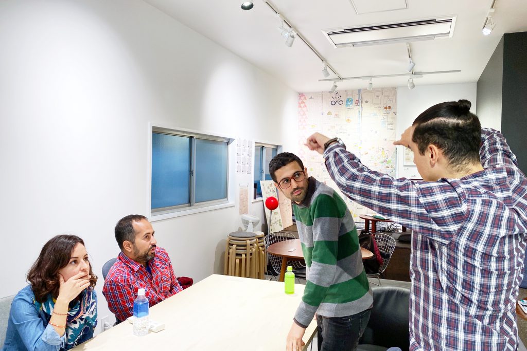
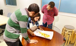
They hadn’t known each other before the interview, but they happened to be visiting Kyoto at the same time! So, we invited them to stop by at the Stroly Kyoto office for an interview together. Such great luck!
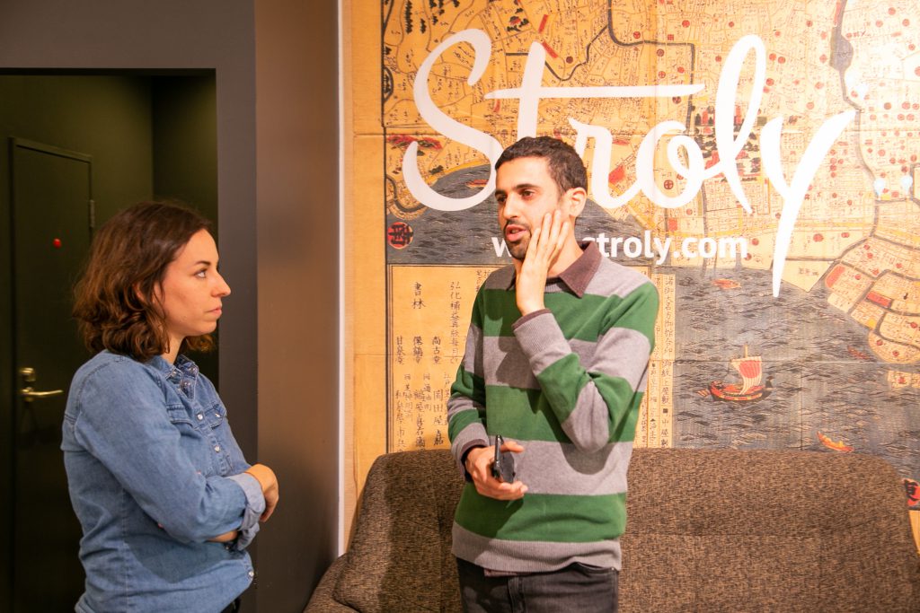
The interviewer this time was Enrique. He’s originally from Mexico and has been working with us as an engineer. He usually doesn’t do interviews, but he accepted our offer happily because he gets little chance to speak in Spanish while living in Japan, Lol!
![]()
Do you have any ideas for upcoming maps from this trip?
![]()
I do, but I’m waiting to get home to start working on it, to gather all the experiences I have encountered. Precisely in Takayama, by chance, we stumbled on this Culture Day Rally, which made you go through many of the temples to get a stamp. You had to start and finish within a set period to collect at least 6 stamps, and then in the Culture Center, redeem it for a prize. I really liked this experience because if it wasn’t for that event, I wouldn’t have gotten to visit so many temples. I also enjoyed that it was a set-route focused not only on highlighting the temples but also on the surrounding landscape. This offered a view from a local perspective, not necessarily touristy. It was an exciting experience for us.
![]()
From my part, I feel I’m just starting to understand the differences among cities. Like, I have spent more days in Tokyo so far compared to Kyoto. But one thing that connected with me on a more emotional level was the tiny “spots” that you find along the way. A small shrine or temple tucked in a corner, a little neighborhood cafe, or a very special place. Including them in city maps would be very interesting to narrate my personal experience, “I went through there,” etc.
![]()
Those stories are fascinating. In no other place, you will be able to learn about them. Or you can read a blog post, but you cannot transport yourself to the same location or find it easily on your phone.
What elements would you like to use in that map to communicate your message more effectively?
![]()
In my case, that’s why I need to get home before I start working. While I’m still traveling, there is so much information around me that I draw blanks. Once I return home, I start pouring this information out, and I begin to identify the essence of the things that I saw and experienced. I only have some basic ideas, but I’ll need to process everything to come up with something more specific. I can’t tell you anything at the moment that sounds interesting, LOL
![]()
For me, it is somewhat similar. I need to get back home and then start recalling memories and “link” them to specific locations. I also start researching more and discovering more information that at the moment I didn’t have, like a Wikipedia article. It’s like a two-part process: the experience, and then the research. That way, I match my experience with the information, and it gives me a more objective vision for the composition of my map.
![]()
Yeah, of course. Without feeling overwhelmed.
Now switching it a bit, we are currently working on finding the pattern for “what makes a good map”? For you guys, what makes an engaging map?
![]()
I think that depends on the purpose of the map itself. Going back to the example of the temple rally, maybe the way the temples are illustrated is more about focusing on an artistic technique, rather than the geographical information. And I think this could be used to express emotion and share more of a more personal story. Other times, the thing that gets my attention it’s the whole composition, not just elements of it, for example, a topographically accurate map that you can use truly to navigate but with more pleasant graphics compared to like, Google Maps or OpenStreetMap.
![]()
A map that follows more the “expected” rules but still refreshingly gets your attention.
![]()
Yes, of course! A map that I can use to navigate but much more engaging visually than Google Maps or Open Street map
![]()
Personally, I like maps, and if they have a lot of details, I love them. Truthfully, if I’m going to use a map, I’ll tend to look for maps that are clear to read and where, I’m not saying it needs a path or something like that, but where I can find the information I’m looking for easily. Some maps are beautiful, but they are so oversaturated in the information that I get lost. How do I get there? Do I go this way or the other way? For example, we went to Gion yesterday, the Geisha district. We used a map from a blog that included the locations of the Ochaya’s (Tea Houses). We were able to spot many Geishas because we used a particular map. We wouldn’t have been able to get that experience ourselves without it. Their map was useful to us because of the information it offered and the way it was displayed. We were able to find exactly what we wanted to see. We wouldn’t be able to do this with any other map.
![]()
So that map offered you more “usability” than engagement, right?
![]()
Yeah, definitely. But a map that is visually attractive and clear to read, like with Stroly where you can combine both it’s super exciting, as a user.
![]()
Yeah, functionality is closely linked with simplicity. I work a lot with transportation maps, which need to remove some information to avoid confusing the users. So removing unnecessary data and simplifying is vital, for a situation, for example, when you are using the Metro or trains.
![]()
That’s true. I was taking a look at your maps of Buenos Aires, and I liked them a lot. You are absolutely right, there is some information that would be considered “noise.”
![]()
It also depends on the moment. I work for the City Government. We are aware that the user needs change depending on the moment they need to use transportation. You don’t need a lot of information or extra detailed information when you start the journey or while you are on the train.
![]()
Yes, of course. Like the underground Metro maps, which only show you some information. You are really not seeing anything outside the window. You only need to see the station information and where you need to switch trains. When you come out the surface, you need additional information to guide you to, for example, a bus stop.
![]()
Some maps are straightforward, but not necessarily minimalistic, but in the way, they lead you to the information you are looking for. Then the use of colors and the way to discern the points of interest sets the mood that makes them appealing and pleasant. That, for me, is the idea of a good map.
![]()
Yeah, this is what we are trying to achieve with our tool. We want to connect the visual story with the technology.
![]()
Maps can have different purposes. One can be the emotional one, where you focus on targeting the engagement of the users. For example, in Kyoto, showcasing the historical aspect of the city as well as its charm. That is a particular goal. A map like that has great artistic and cultural significance. And the map of Kyoto o Tokyo’s transportation system has a different goal in mind. A good map is the one that solves the problem the user is having at that moment.
![]()
I’m in total agreement! It totally depends on the user’s needs. What does it want to do? What it’s the goal? A map will show you the bus routes, for example, but the best places to eat traditional sweets.
I want to ask you guys, how and why did you start making maps? What got you started?
![]()
I’ve always liked maps. When I was younger, I had this Atlas encyclopedia, and I would spend hours reading and admiring the maps. I’m a Graphic Designer, so at work, I would see them as a functional item with a specific purpose and something that can be artistic, emotional, and subjective. That’s how I started to identify that some maps don’t really need to be that specific in their functionality but more emotional. My maps at work have a very defined purpose and use to help people find their way to the transportation routes. With my personal work, I started to explore more subjective and emotional work.
![]()
Same here. I define myself as a curious person, so I’ve always been looking up things in books and maps. My background is in Fine Arts, the first maps I made were made for a Zoo and a water park, and the maps needed to focus more on the illustration while still functional. I also love to travel. I started making maps based on my experiences. When I travel, I bring my notebook, and I make mini-maps as personal notes.
![]()
Do you share those maps publicly, or do you keep them to yourself?
![]()
They are more personal. Mostly because I haven’t sat down to render them more. They are primarily in watercolor sketches. They tend to be more illustrated than functional maps.
![]()
Artistic motivation when you work on a map? What would you like your users to enjoy from your map? How do you want to reach your users?
![]()
With my maps, I try to capture the essence of a place. My personal maps I want to share what I have felt in that place. For example, with my chocolate map of Berlin, that trip was so special for me because I was traveling with my Aunt, and it had a very nostalgic feeling. I wanted to share those emotions with the public. I chose watercolors for that one. The maps I make for commission work have a different purpose and a style, since I mostly use vectors, choose my color palette to match the brand and mood, etc.
![]()
I’m on the same page. My work is mostly digital, and for me, it’s more about learning, I feel like I’m still learning how to reflect warmth in a digital medium. For my Argentinian map, my goal is for people to eat! How to use my resources, colors, make it realistic, and make it tempting to try. That’s mostly using artistic techniques and approaches.
![]()
Do you use references, books, guides, or similar when you make a map?
![]()
I like to do work that reflects my experience and memories. Things I’ve experienced, food that is familiar to me, places that I know. I do research on books or the web, the elements that I want to draw. The start might be a bit erratic, but I fix it little by little. With my transportation maps, it’s a bit of a mix of information that we already know (like the established routes) and then the understanding of it, what information needs to be included, and on what level of the hierarchy. What is the goal of the map? That tends to be a bit more technical, focused, and a bit of trial and error. I sketch my maps with a pencil, to plan the composition, and then I transfer to vectors.
![]()
I do love research. When I go somewhere, I make little notes on the spot, and then at home, I dig deeper for images, information, references. I do bury myself with all this information, and then I start to get rid of some, kinda like sculpting and shaping it. This part I really enjoy a lot, and I think it’s essential. If I should skip it and jump immediately into drawing, like in some commissions I’ve done, I don’t think I enjoy it to fullest. With my digital work, I also start with a pencil sketch. It helps me get a better spatial understanding of the location. With watercolors, since you cannot erase or correct, I work on each element separately to later transfer to digital.
![]() What was your first map?
What was your first map?
![]()
Wow! I don’t think I can remember. Let me think. I think it was a school assignment, and it was about the block where my house is. I included the little shops in the area, my home, and other things.
![]() Did you keep it?
Did you keep it?
![]() I don’t think so. But I remember I drew the Grocery shop
I don’t think so. But I remember I drew the Grocery shop
![]() That’s cool! It would be great to see it and compare it to your recent work.
That’s cool! It would be great to see it and compare it to your recent work.
![]() On a similar note, which map you think was your favorite?
On a similar note, which map you think was your favorite?
![]()
It was a city map. But this wasn’t a map that was requested for me to do, it was more of one born out of necessity. In Buenos Aires, there is the Metro transportation system, but there’s also an urban train. There wasn’t an official map diagram with both the Metro and the urban train information. With so many people commuting to downtown from the suburbs to work, I considered that was such a basic need to exist. I made it, and they started using it publicly.
![]()
With me, I think I started with my commission for the Canary Islands Zoo. Before, I had done a few experiments with my travels. This map required a lot of design work, particularly with the angle perspective the client wanted the map to have. I think that project really got me hooked. After that, I started making more illustrated maps, mostly personal ones. To be honest, I can’t say that it’s my favorite one, because I look back now at it and I’m like, OMG! That’s not my best work!
![]() Is that map still in use? If I visit the zoo, will I see your map?
Is that map still in use? If I visit the zoo, will I see your map?
![]()
Yes, you can still see my work there. I’m still working with that company. But when also made a second map, the Aquatic park one there is a huge difference! An unexpected benefit from working on the first one was that the second map was so much better!
Regarding my favorite map, there are some that you could consider being simple in style, like wedding maps. I feel those can be more emotional even if they are smaller.
![]()
Let’s talk a bit about Stroly. You guys have some of your maps already online, is that right?
![]()
Yes, I have some of them already uploaded to my account. After getting some help from Gio on how to work the editor, I uploaded some of my maps myself.
![]()
I currently have one. I also got help with the basics of it, and I uploaded it myself. It took me a while to get the hang of it!
The latest Stroly map of Maria published in Spring 2020
![]() As artists, what are your current goals?
As artists, what are your current goals?
![]()
I love making my travel notebooks. I would like to be commissioned to travel to a destination to illustrate the travel journey.
![]()
I’m into poster illustration, I’d like to make them travel related.
![]()
What types of maps would you like to experiment in the future? Any technique or place?
![]()
I’d like to work on some environmental maps with the parks you can find in Argentina, with its flora and fauna represented.
![]()
There are some projects I have that involve routes, like the Trans-Siberian train, exploring Chile from North to South, illustrate them using the illustrations from my travel notebooks, but also suggest some other route maps.
![]()
During some of our workshops, some attendees tell us that they want o to illustrate some maps, but they don’t know where to start or how to do this. Do you have any advice?
![]()
I think mental maps can help orient people, not necessarily illustrators, to what’s around them. The biggest misconception is that you feel you need to know exactly where everything is geographically speaking. Where is your house? Where is the bakery? Where is the school? Placing those elements first and then building around it can make the process more straightforward. I think people can feel overwhelmed, and many not really can understand a map at first glance. There are some people that reading maps is complicated for them! Looking at a map and finding yourself in it, it’s not such a universal skill as one might think. Simplifying the information to its basic form should be essential.
![]()
I agree totally with that. I also think the graphic form can also be threatening. How am I going to fit everything? How am I going to shape all my ideas? Maybe there is an opportunity to look into their strengths, “maybe I’m not skilled in a specific style of illustration, but maybe I can do it in a different one.” Or using writing, a map doesn’t necessarily need to be illustrated like we often think they should be. Abstract words or sensations triggered by places. Maybe using colors. I think it’s a matter of identifying what I want to communicate and work on projecting it into the work.
__________________
Check out the websites and SNS accounts of Maria and Sebastian! Please take a look!
Maria Bombassat
Web site: http://mariabombassat.com/
Instagram: https://www.instagram.com/mariabombassat/
Sebastian Gagin(Studio Gagin)
Web site: https://www.gagin.com.ar/
Instagram: https://www.instagram.com/studiogagin/