
Hello again, this is Kaoru!
Today, I want to think about what “Stroly-able map” means to my teammate, Sunny, and me!
Sunny works as a graphic designer here at Stroly. Together, we are the ones behind Stroly’s creative work. Let us introduce ourselves!

Hi, I’m Sunny.
I’m in charge of all design-related work here at Stroly like our UI, WEB or Graphic design, Illustrations, and Advertisement.
I also make the map series, “Stroly loves…” as a way to demonstrate the features and charm of a Strolymap. In the beginning, I was mostly exploring and challenging myself, but after working for Stroly for over a year now, I think I have a more precise idea of the message I want to deliver through these maps. Of course, there is always room for improvement.
I love everything related to handicraft work. I like to draw illustrations, write children’s books, make copper prints and pottery. Working at Stroly is one of my favorite things too.
Oh, and this is my most favorite map on Stroly.
(By Okamoto-cho hometown picture drawing association, Hirakata City, Osaka)
When you take a closer look, you’ll see how impressive the details on this map are. I like this map because there is a bit of storytelling behind these illustrations.
Now, it’s your turn, Kaoru!
Sure! Once again, I’m Kaoru from Stroly. I’m in charge of all the things related to the support of our artist community. I get to meet artists, interview them and write blog articles or posts like this. Even though I make maps on my own, I also work with artists commissioned to make maps for our clients.
I’ve been thinking a lot about “the possibilities in mapmaking” lately. When an idea hits me, I first try to see if it works ideally or not. Sometimes, I ask my teammate for feedback and a bit of brainstorming.
On a side note, I’m also a photographer and artist. I use photographs to create artworks, just like Sunny does. Out of all the things I love, I’d say music, film camera, and going for a walk are the most favorite ones.
My favorite map on Stroly is this one.
(By Sandra Dumais)
I learned the importance of including people in an illustrated map from this map. I also love the laid back atmosphere that you get from it.
Nice to meet you all!
・・・
Alright, now that we’ve gotten more acquainted, we want to chat about the maps we make, the struggles we encounter, and what things we want to challenge ourselves with in the future.
We hope this conversation could reveal some know-how on mapmaking and help artists have some different insights.
① How do you draw a map? How do you describe your style?
I have two critical things I pay attention to when I create a map that will be using Stroly.
One is setting a target and purpose of the map. If possible, I think it’s also essential to have the idea of what means of transportation are used to reach the area on the map or to move around in it.
I used to have a feeling that my maps weren’t user-friendly and didn’t have an explicit purpose because I wasn’t considering this from the beginning.
So recently, I try to have more defined and established answers to the following questions as the first step in making a map.
① Who is the audience for this map?
② What information will they want?
③ In what scenarios will they use this map? (while driving a car, moving by train, or walking?)
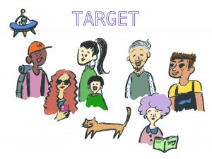
Answering these questions help me have a clear idea of who I want to communicate with. Additionally, it helps me make decisions on what streets to draw, or what kind of points of interest I will include.
(Reference: When you are lost in creating a map…)
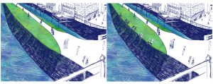
Secondly, I’m careful with how I present my illustrations. Specifically, I’m thinking of how they will look like when the users zoom-in using their smartphones.
If a map has only large illustrations, users will see blurry images when they zoom in. I think when this happens, users lose interest or a sense of immersion.
Instead, if I draw smaller illustrations that make the user have to zoom-in, and if I can add some story related to the map to them, users would be triggered and look for more of these hidden illustrations. As a result, the amount of time they spend on the map
would increase.
When I see the maps I made in the past, they don’t include these characteristics, and they don’t look fun to use, so I want to fix them along the way.
( Images after zoom-in; Left: a street without details, Middle: meaningless red dots, Right: a piece of the image that can’t tell users what exactly it is)
Speaking of illustrations, I used to fill out all the available space with illustrations, but now I make more room for negative space. I focus more on the story and the context of the map.
Now, I think space is something users can fill out if the context is more useful. Proper use of negative space can be a break from information and a place where they can build expectations to explore the next point of interest.
That makes sense, but how do you create good context?
I think having captivating illustrations is one way, but making use of parallel text in the map itself can also help.
Even if you don’t feel completely passionate or attached to the place you are describing, you can always use interviews or get comments from locals. I think having these stories can make the map more alive.
Absolutely.
I used to include my comments and illustrations in Landmark Pins so users can click and view the details. Still, recently, I started thinking that showing them on the map directly without hiding in Pins can catch the user’s eyes.
If the users can read or see the personality of the artist through those descriptions, they will find the map more unique and special.
Definitely. We should use space wisely!
I was thinking of recommending to show the descriptions.
I made this map focusing on the context and the way I present it. I included many comments from a person who has worked there for about ten years. She knows and loves the area. I arranged her remarks as an introduction, recommendations for shops, restaurants, and stories about the area; this way, it’s not a regular street map. She is sharing the way she sees and experiences it with this map, which makes the map more fun and engaging. I also think users will fully trust the information and feel confident because she is very familiar with the area and not trying to upsell anything.
Another thing I focus on when I create a map is to draw within an area where people can actually walk around.
Also, I started changing the way I see maps. I think maps are something you see but also read, so lining up information on a map can be boring because the context will be similar to the others even if the style of the illustrations vary. I want my maps to be more like a picture book, have unique information that can help stimulate the user’s senses—for example, an illustration of a street full of cats or the wonderful smell of bread.
Strolymaps aren’t quite navigational maps that will take users from point A to point B quickly, as they show you content based on your current location. I want to be able to share many kinds of experiences they can enjoy at the spot.
①:Summary
■Set a goal and purpose, and scenes of usage (means of transportation). This will make you select information through a user’s perspective
■Set boundaries of your map in the area where users can easily walk around
■Design illustrations in a way users can enjoy when they zoom-in and out. This will make users spend more time on your map
■Don’t worry about negative space
■Pay attention more to the story or context of your map than the quality of your illustrations. This will improve the user experience.
■Ask people who love the area for comments and anecdotes
■Don’t hide unique comments in Landmark Pins. Show them directly on the map too.
■Introduce a guide character or protagonist. Users may feel related to the person and trust the information
■Maps that are interesting to read or that can stimulate the user’s sensory reactions can be related to what Stroly-able map is.
②What design of “Landmark Pins” looks good on Stroly?
Lately, I really like the customized Pins you’ve designed. Especially, I love the transparent one!
Thank you! I’m glad to hear that.
I’m sure a popular consensus is, “The design of the Pins doesn’t match my style, and I don’t want to use them”, even among the artists who publish Strolymaps regularly.
As a map creator, I strongly care about composition.
When I use the default Pins, I sometimes feel like they mess up the whole design, so I created the transparent Pins when I was wondering how to fit it in.
Because it’s transparency, viewers can see the area behind them, and it doesn’t get in the way of the streets or images that much. Also, it’s easy to count the number of Pins, even if they are overlapping. I think they are very useful.
I totally agree with you. I think the Pins you’ve designed have great features!
I also like the Pin that turns “ココ(Here)” when you click. It’s very helpful!
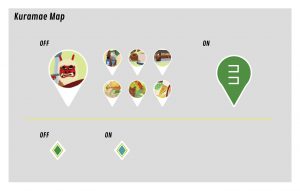
If you use the default Pin and you click on it, the color changes from red to blue. But honestly, I think having such a subtle change of color sometimes confuses me about which Pin I’m opening. So, I tried your idea of the Pin with the “Here” indicator with my map.
I knew you’d tried it! It made me so happy! Thank you!
Another great idea of a customized Pin is in this map of Taiwan. The artist uses each illustration as a Pin. I think the artist is making the best use of the feature of customized Pin.
I was impressed by each design of the Pin! It really draws my attention. I‘ve never tried using illustrations as Pins, but I want to try it with a future map.
I also want to see the possibility of transparent Pins. I’m thinking of combining the transparent Pins with the “Here” label.
It’s very fun to me creating your own customized Pin icons, and I want to share it with our community. If many artists make more customized Pins, I think we can discover more cool and creative Pin ideas.
(Reference: How to design cool customized Landmark Pins?)
②:Summary
◼︎Design personalized Pins for your Strolymaps
◼︎Personalized Pin requires images for ACTIVE and INACTIVE
◼Personalized Pins with the label “Here” when it’s ON helps improve the user experience
◼︎Transparent Pin solved problems of the icons blocking images
◼︎Illustration of point of interest can be a personalized pin itself
◼Design your maps with the idea of personalized pins in mind
③What do you struggle with when you create a map?
I feel I’ve been struggling a lot when I have to create a map of a place I’m not familiar with. I’m currently working on a map of Austin, TX for advertisement use. I use the Google street view to get a grasp of the ambiance and mood, but sometimes I can’t see the full detail of a building, or sometimes, the building is so close I can’t see the whole thing.
Are you talking about non-touristy areas or local buildings that you can’t find on the internet?
I’m talking more about the accuracy of my map. For example, a street shows as going diagonally on Google Maps, but it’s shown as a straight in the street view map. Because I’m not local, I can’t tell which way is the orientation most familiar to the users.
I don’t want to make just an artwork by drawing a map that isn’t real to locals and visitors.
I know what you mean. Sometimes only locals can tell you which streets are related to their daily lives, for example, shopping, going to work, or visiting on the weekends.
It’s essential to know if the street goes straight or diagonally because it will determine the space and composition I will have to work with.
Because of that, I tend to make maps of my hometown, Kyoto. It does take a lot of effort to create a map of somewhere else.
I love the process of researching the main areas of a city I’m not familiar with. Still, when I see my draft, to me, it looks somewhat artificial because it depends on the information I find on the internet and doesn’t really reflect real life. I feel bad and it makes me think people might not like my map.
I once heard a story from a manga artist who got negative feedback from a reader. He drew a typical Kyoto scenery but didn’t include the couples sitting along the riverbank of the Kamogawa. You’ll find couples from Spring until it gets cold, and the scenery is quite famous because they always sit a certain distance apart even though they don’t talk with each other. The manga was about Kyoto, and the artist missed these details. The reader told him; “Your observations aren’t good enough! You don’t really get Kyoto!”

I see. We can’t really get a feel of the people’s local habits by using Google Street He got the negative feedback. view alone.
On the other hand, I also feel like I’m being too much of a perfectionist and pressuring myself, so I tell myself that it’s okay to use my imagination.
You have a point. I think so, too.
I want to be able to find as many connections as I could even when I draw with imagination so that I can feel more attached to my map and the area.
④What do you want to try in the future?
I want to visit places, do local coverage, and create maps. It might give some pressure on me at the same time, though.
I also want to use my spare time to make more maps for the Stroly Loves series. I’m thinking of starting with favorite maps of all Stroly members.
Lastly, I want to start working on a series of maps for the Tokyo Olympics by featuring a theme like 23 Tokyo district sightseeing maps or a Tokyo museum map.
How about you, Kaoru?
I’m currently with a professional artist, Ms.Moriyuka, to see if we can make a map utilizing the zoom feature.
We are thinking of adding details that can be seen only when the users zoom in. One idea is adding stories using a very small font. The concept is closer to a “Where’s Waldo?” type of interaction. I want to make it fun to read, though.
I like the idea! It’s unique. You can’t tell what’s written at first glance, but when you zoom in, you’ll find out more details. For example, you’ll see illustrations of a bakery, freshly baked bread or tiny ants walking around it, etc. The users can play around with the map to look for more details.
Exactly! If we want readers to know the story behind the map, I think this trick might be a great way to present it.
I feel when I draw an illustrated map, the size of illustrations gets larger because I want to feature them. Then, I’ll face the problem of having some overlapped pictures.
So, by using the zoom-in feature wisely, we can put emphasis on some illustrations and make them big, and make the others really small to describe side-stories. If we make a distinction of the information we want to display, the maps will become more engaging, and I think readers would like to spend more time using the map and finding its little details.
Here is an idea of using the zoom-in and out feature! How about creating a map of following a specific person for 24 hours in a certain area. We have to be careful with the privacy policy and selecting the person, though.
I like the idea!
I have a couple of maps that I’m working on now, so I want to try and see how my ideas turn out.
OMG, I’m pumped with energy now! I’m looking forward to them!
・・・
I enjoyed having this meeting! Let’s do this more often. I want to exchange opinions and update my ideas regularly.
I’d be happy this article can help artists or designers develop their ideas.
My feelings exactly!
Let’s keep talking and inform each other from broad ideas to narrow topics like the process of creating a map. I’d love to work with you and keep updating our blogs.
Thanks!